最新资源


简介
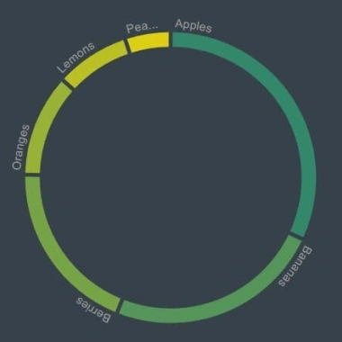
我们以前都看过甜甜圈图。它们是以循环格式可视化数据的好方法。
在本文中,我们将向您展示如何使用donutgraph.js jQuery插件创建动画圆环图(也称为环形图)。
这个插件使用简单,建立在jQuery和D3.js之上。它为您的图表添加了一个有趣的互动元素,让用户保持参与。
我们还将分享一些如何让你的甜甜圈图看起来更专业的技巧。
所以,如果你正在寻找一种很酷的方式来激活你的数据可视化项目,一定要看看这篇文章!
如何使用它:
1.在文档中加载所需的jQuery库和d3.js库。
- <script src="/path/to/cdn/jquery.min.js"></script>
- <script src="/path/to/cdn/d3.min.js"></script>
2.在jQuery之后加载jQuery donutgraph.js插件。
- <script src="plugin.min.js"></script>
3.创建一个空的DIV容器来容纳甜甜圈图。
- <div id="graph"></div>
4.准备好要在甜甜圈图中显示的数据。
- var sampleData = [
- {
- id: 1,
- label: "jQuery",
- value: 13.5,
- color: "#80c441"
- },
- {
- id: 2,
- label: "Script",
- value: 13.5,
- color: "#80c441"
- },
- {
- id: 3,
- label: "Net",
- value: 13.5,
- color: "#80c441"
- }
- // ...
- ]
5.调用该函数以生成默认的圆环图。
- $("#graph").donutgraph({
- data: sampleData
- });
6.这些是所有可用的设置,可以与donutgraph插件一起调用。
- $("#graph").donutgraph({
- // wrapper element
- container: "#graph",
- // container element (span) for measuring label text
- measureElement: "#measure",
- // width & height of the donut chart
- width: 400,
- height: 400,
- // ring width
- donutWidth: 20,
- // space angle between ring segments
- padAngle: 0.02,
- // duration of the animation
- animationDuration: 750,
- // label color
- labelColor: "#9e9e9e",
- // an array of colors
- accentColor: ["#d81b60","#80c441"],
- // an array of colors used for ring segments
- colorSetting: ["#33876b","#559559","#77a347","#98b236","#bac024","#dcce12","#e0e0e0"],
- // use color range as setted in colorSetting
- useColorRange: true
- });
7.手动更新数据。
- $("#graph").donutgraph("update", newData);
8.当数据发生变化时执行一个函数。
- $("#graph").donutgraph({
- onChange: function(obj) {
- console.log(obj);
- labelsOnUpdate(obj);
- }
- });
预览截图
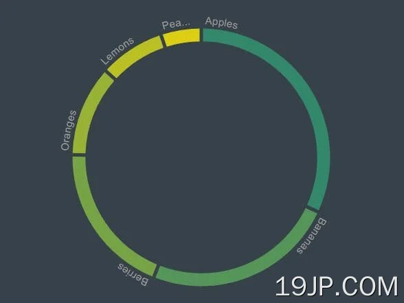 带jQuery和D3.js 环形(圆环)动画图表插件