最新资源


简介
autoNumeric是一个用于国际货币格式和数字格式的有用JavaScript库。
它几乎支持欧洲、北美和南美、亚洲和印度使用的所有主要国际数字格式和货币符号。
您可能还喜欢:
- 带有jQuery的简易数字格式插件-数字
- 输入字段数据格式插件-掩码
- 价格格式jQuery插件-价格格式
如何使用它:
1.安装和导入。
- # Yarn
- $ yarn add autonumeric
- # NPM
- $ npm install autonumeric --save
- import AutoNumeric from 'autonumeric';
2.或者在网页上包含最新的autoNumeric.js
- <script src="/path/to/autoNumeric.js"></script>
- <!-- from a cdn -->
- <script src="//unpkg.com/autonumeric"></script>
3.在页面上创建一个普通输入字段。
- <form>
- <input type="text" class="demo">
- </form>
4.初始化autoNumeric库并指定货币符号。完成。
- new AutoNumeric('.demo', { currencySymbol : '$' });
5.所有选项和默认值。您还可以通过HTML5数据属性传递以下选项。
- /* Defines if the decimal places should be padded with zeroes
- * `true` : always pad decimals with zeros (ie. '12.3400')
- * `false` : never pad with zeros (ie. '12.34')
- * `'floats'` : pad with zeroes only when there are decimals (ie. '12' and '12.3400')
- * Note: setting allowDecimalPadding to 'false' will override the 'decimalPlaces' setting.
- */
- allowDecimalPadding: {
- always: true,
- never : false,
- floats: 'floats',
- },
- /* Defines if the decimal character or decimal character alternative should be accepted when there is already a decimal character shown in the element.
- * If set to `true`, any decimal character input will be accepted and will subsequently modify the decimal character position, as well as the `rawValue`.
- * If set to `false`, the decimal character and its alternative key will be dropped as before. This is the default setting.
- */
- alwaysAllowDecimalCharacter: {
- alwaysAllow: true,
- doNotAllow: false,
- },
- /* Defines where should be positioned the caret on focus
- * null : Do not enforce any caret positioning on focus (this is needed when using `selectOnFocus`)
- * `'start'` : put the caret of the far left side of the value (excluding the positive/negative sign and currency symbol, if any)
- * `'end'` : put the caret of the far right side of the value (excluding the positive/negative sign and currency symbol, if any)
- * `'decimalLeft'` : put the caret of the left of the decimal character if any
- * `'decimalRight'` : put the caret of the right of the decimal character if any
- */
- caretPositionOnFocus: {
- start : 'start',
- end : 'end',
- decimalLeft : 'decimalLeft',
- decimalRight : 'decimalRight',
- doNoForceCaretPosition: null,
- },
- /* Defines if a local list of AutoNumeric objects should be kept when initializing this object.
- * This list is used by the `global.*` functions.
- */
- createLocalList: {
- createList : true,
- doNotCreateList: false,
- },
- /* Defines the currency symbol string.
- * It can be a string of more than one character (allowing for instance to use a space on either side of it, example: '$ ' or ' $')
- * cf. https://en.wikipedia.org/wiki/Currency_symbol
- */
- currencySymbol: {
- none : '',
- currencySign : '¤',
- austral : 'â³', // ARA
- australCentavo: '¢',
- baht : '฿', // THB
- cedi : 'âµ', // GHS
- cent : '¢',
- colon : 'â¡', // CRC
- cruzeiro : 'â¢', // BRB - Not used anymore since 1993
- dollar : '$',
- dong : 'â«', // VND
- drachma : 'â¯', // GRD (or 'ÎÏÏ.' or 'ÎÏ.')
- dram : 'âÖ', // AMD
- european : 'â ', // XEU (old currency before the Euro)
- euro : 'â¬', // EUR
- florin : 'Æ',
- franc : 'â£', // FRF
- guarani : 'â²', // PYG
- hryvnia : 'â´', // гÑн
- kip : 'â', // LAK
- att : 'àºàº±àº', // cents of the Kip
- lepton : 'Î.', // cents of the Drachma
- lira : 'âº', // TRY
- liraOld : 'â¤',
- lari : 'â¾', // GEL
- mark : 'â³',
- mill : 'â¥',
- naira : 'â¦', // NGN
- peseta : 'â§',
- peso : 'â±', // PHP
- pfennig : 'â°', // cents of the Mark
- pound : '£',
- real : 'R$ ', // Brazilian real
- riel : 'á', // KHR
- ruble : 'â½', // RUB
- rupee : 'â¹', // INR
- rupeeOld : 'â¨',
- shekel : 'âª',
- shekelAlt : 'ש״×ââ',
- taka : '৳', // BDT
- tenge : 'â¸', // KZT
- togrog : 'â®', // MNT
- won : 'â©',
- yen : 'Â¥',
- },
- /* Defines where the currency symbol should be placed (before of after the numbers)
- * for prefix currencySymbolPlacement: "p" (default)
- * for suffix currencySymbolPlacement: "s"
- */
- currencySymbolPlacement: {
- prefix: 'p',
- suffix: 's',
- },
- /* Defines what decimal separator character is used
- */
- decimalCharacter: {
- comma : ',',
- dot : '.',
- middleDot : '·',
- arabicDecimalSeparator : 'Ù«',
- decimalSeparatorKeySymbol: 'â',
- },
- /* Allow to declare an alternative decimal separator which is automatically replaced by `decimalCharacter` when typed.
- * This is used by countries that use a comma ',' as the decimal character and have keyboards with a numeric pads that have
- * a period 'full stop' as the decimal character (France or Spain for instance).
- */
- decimalCharacterAlternative: {
- none : null,
- comma: ',',
- dot : '.',
- },
- /* Defines the default number of decimal places to show on the formatted value, and keep for the precision.
- * Incidentally, since we need to be able to show that many decimal places, this also defines the raw value precision by default.
- */
- decimalPlaces: {
- none : 0,
- one : 1,
- two : 2,
- three: 3,
- four : 4,
- five : 5,
- six : 6,
- },
- /* Defines how many decimal places should be kept for the raw value (ie. This is the precision for float values).
- *
- * If this option is set to `null` (which is the default), then the value of `decimalPlaces` is used for `decimalPlacesRawValue` as well.
- * Note: Setting this to a lower number of decimal places than the one to be shown will lead to confusion for the users.
- */
- decimalPlacesRawValue: {
- useDefault: null,
- none : 0,
- one : 1,
- two : 2,
- three : 3,
- four : 4,
- five : 5,
- six : 6,
- },
- /* Defines how many decimal places should be visible when the element is unfocused.
- * If this is set to `null`, then this option is ignored, and the `decimalPlaces` option value will be used instead.
- * This means this is optional ; if omitted the decimal places will be the same when the input has the focus.
- *
- * This option can be used in conjonction with the two other `scale*` options, which allows to display a different formatted value when the element is unfocused, while another formatted value is shown when focused.
- * For those `scale*` options to have any effect, `divisorWhenUnfocused` must not be `null`.
- */
- decimalPlacesShownOnBlur: {
- useDefault: null,
- none : 0,
- one : 1,
- two : 2,
- three : 3,
- four : 4,
- five : 5,
- six : 6,
- },
- /* Defines how many decimal places should be visible when the element has the focus.
- * If this is set to `null`, then this option is ignored, and the `decimalPlaces` option value will be used instead.
- *
- * Example:
- * For instance if `decimalPlacesShownOnFocus` is set to `5` and the default number of decimal places is `2`, then on focus `1,000.12345` will be shown, while without focus `1,000.12` will be set back.
- * Note 1: the results depends on the rounding method used.
- * Note 2: the `getNumericString()` method returns the extended decimal places
- */
- decimalPlacesShownOnFocus: {
- useDefault: null,
- none : 0,
- one : 1,
- two : 2,
- three : 3,
- four : 4,
- five : 5,
- six : 6,
- },
- /* Helper option for ASP.NET postback
- * This should be set as the value of the unformatted default value
- * examples:
- * no default value="" {defaultValueOverride: ""}
- * value=1234.56 {defaultValueOverride: '1234.56'}
- */
- defaultValueOverride: {
- doNotOverride: null,
- },
- /* Defines how many numbers should be grouped together (usually for the thousand separator)
- * - "2", results in 99,99,99,999 India's lakhs
- * - "2s", results in 99,999,99,99,999 India's lakhs scaled
- * - "3", results in 999,999,999 (default)
- * - "4", results in 9999,9999,9999 used in some Asian countries
- * Note: This option does not accept other grouping choice.
- */
- digitalGroupSpacing: {
- two : '2',
- twoScaled: '2s',
- three : '3',
- four : '4',
- },
- /* Defines the thousand grouping separator character
- * Example : If `'.'` is set, then you'll get `'1.234.567'`
- */
- digitGroupSeparator: {
- comma : ',',
- dot : '.',
- normalSpace : ' ',
- thinSpace : '\u2009',
- narrowNoBreakSpace : '\u202f',
- noBreakSpace : '\u00a0',
- noSeparator : '',
- apostrophe : `'`,
- arabicThousandsSeparator: 'Ù¬',
- dotAbove : 'Ë',
- privateUseTwo : 'â', // \u0092
- },
- /* The `divisorWhenUnfocused` divide the element value on focus.
- * On blur, the element value is multiplied back.
- *
- * Example : Display percentages using { divisorWhenUnfocused: 100 } (or directly in the Html with `<input data-divisor-when-unfocused="100">`)
- * The divisor value does not need to be an integer, but please understand that Javascript has limited accuracy in math ; use with caution.
- * Note: The `getNumericString` method returns the full value, including the 'hidden' decimals.
- */
- divisorWhenUnfocused: {
- none : null,
- percentage: 100,
- permille : 1000,
- basisPoint: 10000,
- },
- /* Defines what should be displayed in the element if the raw value is an empty string ('').
- * - 'focus' : The currency sign is displayed when the input receives focus (default)
- * - 'press' : The currency sign is displayed whenever a key is being pressed
- * - 'always' : The currency sign is always displayed
- * - 'zero' : A zero is displayed ('rounded' with or without a currency sign) if the input has no value on focus out
- * - 'min' : The minimum value is displayed if the input has no value on focus out
- * - 'max' : The maximum value is displayed if the input has no value on focus out
- * - 'null' : When the element is empty, the `rawValue` and the element value/text is set to `null`. This also allows to set the value to `null` using `anElement.set(null)`.
- */
- emptyInputBehavior: {
- focus : 'focus',
- press : 'press',
- always: 'always',
- zero : 'zero',
- min : 'min',
- max : 'max',
- null : 'null',
- },
- /* Defines if the custom and native events triggered by AutoNumeric should bubble up or not.
- */
- eventBubbles: {
- bubbles: true,
- doesNotBubble: false,
- },
- /* Defines if the custom and native events triggered by AutoNumeric should be cancelable.
- */
- eventIsCancelable: {
- isCancelable: true,
- isNotCancelable: false,
- },
- /* This option is the 'strict mode' (aka 'debug' mode), which allows autoNumeric to strictly analyse the options passed, and fails if an unknown options is used in the settings object.
- * You should set that to `true` if you want to make sure you are only using 'pure' autoNumeric settings objects in your code.
- * If you see uncaught errors in the console and your code starts to fail, this means somehow those options gets polluted by another program (which usually happens when using frameworks).
- */
- failOnUnknownOption: {
- fail : true,
- ignore: false,
- },
- /* Determine if the default value will be formatted on initialization.
- */
- formatOnPageLoad: {
- format : true, // automatically formats the default value on initialization
- doNotFormat: false, // will not format the default value on initialization
- },
- /* Defines if the 'formula mode' can be activated by the user.
- * If set to `true`, then the user can enter the formula mode by entering the '=' character.
- * He will then be allowed to enter any simple math formula using numeric characters as well as the following operators +, -, *, /, ( and ).
- * The formula mode is closed when the user either validate their math expression using the `Enter` key, or when the element is blurred.
- * If the formula is invalid, the previous valid `rawValue` is set back, and the `autoNumeric:invalidFormula` event is sent.
- * When a valid formula is accepted, then its result is `set()`, and the `autoNumeric:validFormula` event is sent.
- *
- * By default, this mode is disabled.
- */
- formulaMode: {
- enabled : true,
- disabled: false,
- },
- /* Set the undo/redo history table size.
- * Each record keeps the raw value as well and the last known caret/selection positions.
- */
- historySize: {
- verySmall: 5,
- small : 10,
- medium : 20,
- large : 50,
- veryLarge: 100,
- insane : Number.MAX_SAFE_INTEGER,
- },
- /* Defines the name of the CSS class to use on contenteditable-enabled elements when the value is invalid
- * This is not used when the HTML element used is an input.
- */
- invalidClass: 'an-invalid',
- /* Allow the user to 'cancel' and undo the changes he made to the given autonumeric-managed element, by pressing the 'Escape' key.
- * Whenever the user 'validate' the input (either by hitting 'Enter', or blurring the element), the new value is saved for subsequent 'cancellation'.
- *
- * The process :
- * - save the input value on focus
- * - if the user change the input value, and hit `Escape`, then the initial value saved on focus is set back
- * - on the other hand if the user either have used `Enter` to validate (`Enter` throws a change event) his entries, or if the input value has been changed by another script in the mean time, then we save the new input value
- * - on a successful 'cancel', select the whole value (while respecting the `selectNumberOnly` option)
- * - bonus; if the value has not changed, hitting 'Esc' just select all the input value (while respecting the `selectNumberOnly` option)
- */
- isCancellable: {
- cancellable : true,
- notCancellable: false,
- },
- /* Controls the leading zero behavior
- * - 'allow' : allows leading zeros to be entered. Zeros will be truncated when entering additional digits. On focusout zeros will be deleted
- * - 'deny' : allows only one leading zero on values that are between 1 and -1
- * - 'keep' : allows leading zeros to be entered. on focusout zeros will be retained
- */
- leadingZero: {
- allow: 'allow',
- deny : 'deny',
- keep : 'keep',
- },
- /* Defines the maximum possible value a user can enter.
- * Notes:
- * - this value must be a string and use the period for the decimal point
- * - this value needs to be larger than `minimumValue`
- */
- maximumValue: {
- tenTrillions : '10000000000000', // 10000 billions
- oneBillion : '1000000000',
- zero : '0',
- },
- /* Defines the minimum possible value a user can enter.
- * Notes:
- * - this value must be a string and use the period for the decimal point
- * - this value needs to be smaller than `maximumValue`
- * - if this is superior to 0, then you'll effectively prevent your user to entirely delete the content of your element
- */
- minimumValue: {
- tenTrillions : '-10000000000000', // 10000 billions
- oneBillion : '-1000000000',
- zero : '0',
- },
- /* Allows the user to increment or decrement the element value with the up and down arrow keys.
- * The behavior is similar to the mouse wheel one.
- * The up and down arrow keys behavior can be modified by the `upDownStep` option.
- * This `upDownStep` option can be used in two ways, either by setting:
- * - a 'fixed' step value (`upDownStep : 1000`), or
- * - the 'progressive' string (`upDownStep : 'progressive'`), which will then activate a special mode where the step is automatically calculated based on the element value size.
- */
- modifyValueOnUpDownArrow: {
- modifyValue: true,
- doNothing : false,
- },
- /* Allows the user to increment or decrement the element value with the mouse wheel.
- * The behavior is similar to the up/down arrow one.
- * The wheel behavior can be modified by the `wheelStep` option.
- * This `wheelStep` option can be used in two ways, either by setting:
- * - a 'fixed' step value (`wheelStep : 1000`), or
- * - the 'progressive' string (`wheelStep : 'progressive'`), which will then activate a special mode where the step is automatically calculated based on the element value size.
- *
- * Note :
- * You can activate/deactivate the wheel event for each `wheelOn` option value by using the 'Shift' modifier key while using the mouse wheel.
- */
- modifyValueOnWheel: {
- modifyValue: true,
- doNothing : false,
- },
- /* Adds brackets on negative values (ie. transforms '-$ 999.99' to '($999.99)')
- * Those brackets are visible only when the field does NOT have the focus.
- * The left and right symbols should be enclosed in quotes and separated by a comma.
- */
- negativeBracketsTypeOnBlur: {
- parentheses : '(,)',
- brackets : '[,]',
- chevrons : '<,>',
- curlyBraces : '{,}',
- angleBrackets : 'ã,ã',
- japaneseQuotationMarks: 'ï½¢,ï½£',
- halfBrackets : '⸤,⸥',
- whiteSquareBrackets : 'â¦,â§',
- quotationMarks : 'â¹,âº',
- guillemets : '«,»',
- none : null, // This is the default value, which deactivate this feature
- },
- /* Placement of the negative/positive sign relative to the `currencySymbol` option.
- *
- * Example:
- * // Default values
- * -1,234.56 => default no options required
- * $-1,234.56 => {currencySymbol: "$", negativePositiveSignPlacement: "r"} // Default if negativePositiveSignPlacement is 'null' and currencySymbol is not empty
- *
- * // Sign on the left hand side of the whole number
- * -$1,234.56 => {currencySymbol: "$"} or {currencySymbol: "$", negativePositiveSignPlacement: "l"}
- * -1,234.56$ => {currencySymbol: "$", currencySymbolPlacement: "s", negativePositiveSignPlacement: "p"} // Default if negativePositiveSignPlacement is 'null' and currencySymbol is not empty
- *
- * // Sign on the right hand side of the whole number
- * 1,234.56- => {negativePositiveSignPlacement: "s"}
- * $1,234.56- => {currencySymbol: "$", negativePositiveSignPlacement: "s"}
- * 1,234.56-$ => {currencySymbol: "$", currencySymbolPlacement: "s"}
- * 1,234.56$- => {currencySymbol: "$", currencySymbolPlacement: "s", negativePositiveSignPlacement: "r"}
- */
- negativePositiveSignPlacement: {
- prefix: 'p',
- suffix: 's',
- left : 'l',
- right : 'r',
- none : null,
- },
- /* Defines the negative sign symbol.
- * It can be a string of only one character.
- */
- negativeSignCharacter: {
- hyphen : '-',
- minus : 'â',
- heavyMinus : 'â',
- fullWidthHyphen: 'ï¼',
- circledMinus : 'â',
- squaredMinus : 'â',
- triangleMinus : '⨺',
- plusMinus : '±',
- minusPlus : 'â',
- dotMinus : 'â¸',
- minusTilde : 'â',
- not : '¬',
- },
- /*
- * Defines if the negative sign should be toggled when hitting the negative or positive key multiple times.
- * When `toggle` is used, using the same '-' on '+' key will toggle between a positive and negative value.
- * When `doNotToggle` is used, using '-' will always set the value negative, and '+' will always set the value positive.
- */
- negativePositiveSignBehavior: {
- toggle : true,
- doNotToggle: false,
- },
- /* Defines if the element should have event listeners activated on it.
- * By default, those event listeners are only added to <input> elements and html element with the `contenteditable` attribute set to `true`, but not on the other html tags.
- * This allows to initialize elements without any event listeners.
- * Warning: Since AutoNumeric will not check the input content after its initialization, using some autoNumeric methods afterwards *will* probably leads to formatting problems.
- */
- noEventListeners: {
- noEvents : true,
- addEvents: false,
- },
- /* Manage how autoNumeric react when the user tries to paste an invalid number.
- * - 'error' : (This is the default behavior) The input value is not changed and an error is output in the console.
- * - 'ignore' : idem than 'error', but fail silently without outputting any error/warning in the console.
- * - 'clamp' : if the pasted value is either too small or too big regarding the minimumValue and maximumValue range, then the result is clamped to those limits.
- * - 'truncate' : autoNumeric will insert as many pasted numbers it can at the initial caret/selection, until everything is pasted, or the range limit is hit.
- * The non-pasted numbers are dropped and therefore not used at all.
- * - 'replace' : autoNumeric will first insert as many pasted numbers it can at the initial caret/selection, then if the range limit is hit, it will try
- * to replace one by one the remaining initial numbers (on the right side of the caret) with the rest of the pasted numbers.
- *
- * Note 1 : A paste content starting with a negative sign '-' will be accepted anywhere in the input, and will set the resulting value as a negative number
- * Note 2 : A paste content starting with a number will be accepted, even if the rest is gibberish (ie. '123foobar456').
- * Only the first number will be used (here '123').
- * Note 3 : The paste event works with the `decimalPlacesShownOnFocus` option too.
- */
- onInvalidPaste: {
- error : 'error',
- ignore : 'ignore',
- clamp : 'clamp',
- truncate: 'truncate',
- replace : 'replace',
- },
- /* Defines how the value should be formatted when wanting a 'localized' version of it.
- * - null or 'string' => 'nnnn.nn' or '-nnnn.nn' as text type. This is the default behavior.
- * - 'number' => nnnn.nn or -nnnn.nn as a Number (Warning: this works only for integers inferior to Number.MAX_SAFE_INTEGER)
- * - ',' or '-,' => 'nnnn,nn' or '-nnnn,nn'
- * - '.-' => 'nnnn.nn' or 'nnnn.nn-'
- * - ',-' => 'nnnn,nn' or 'nnnn,nn-'
- *
- * Note: The hyphen '-' is translated to the custom negative sign defined in `negativeSignCharacter`
- */
- outputFormat: {
- string : 'string',
- number : 'number',
- dot : '.',
- negativeDot : '-.',
- comma : ',',
- negativeComma: '-,',
- dotNegative : '.-',
- commaNegative: ',-',
- none : null,
- },
- /* Defines if AutoNumeric should let the user override the minimum and/or maximum limits when he types numbers in the element.
- * - 'ceiling' Strictly adheres to `maximumValue` and ignores the `minimumValue` settings
- * It allows the user to enter anything between -â `and maximumValue`
- * If `maximumValue` is less than 0, then it will prevent the user emptying the field or typing value above `maximumValue`, making sure the value entered is always valid
- * - 'floor' Strictly adheres to `minimumValue` and ignores the `maximumValue` settings
- * It allows the user to enter anything between `minimumValue` and +â
- * If `minimumValue` is higher than 0, then it will prevent the user emptying the field or typing value below `minimumValue`, making sure the value entered is always valid
- * - 'ignore' Ignores both the `minimumValue` and `maximumValue` settings
- * When using this option, the field will always be valid range-wise
- * - 'invalid' The user can temporarily type out-of-bound values. In doing so, the invalid state is set on the field.
- * Whenever an invalid value is typed, an 'autoNumeric:invalidValue' event is sent
- * When the value is correctly set back within the limit boundaries, the invalid state is removed, and the 'autoNumeric:correctedValue' event is sent
- * - 'doNotOverride' Strictly adheres to the `maximumValue` and `minimumValue` settings
- * This is the default behavior
- * If `0` is out of the min/max range, this will prevent the user clearing the input field, making sure the value entered is always valid
- */
- overrideMinMaxLimits: {
- ceiling : 'ceiling',
- floor : 'floor',
- ignore : 'ignore',
- invalid : 'invalid',
- doNotOverride: null,
- },
- /* Defines the positive sign symbol.
- * It can be a string of only one character.
- * This is shown only if `showPositiveSign` is set to `true`.
- */
- positiveSignCharacter: {
- plus : '+',
- fullWidthPlus : 'ï¼',
- heavyPlus : 'â',
- doublePlus : '⧺',
- triplePlus : '⧻',
- circledPlus : 'â',
- squaredPlus : 'â',
- trianglePlus : '⨹',
- plusMinus : '±',
- minusPlus : 'â',
- dotPlus : 'â',
- altHebrewPlus : '﬩',
- normalSpace : ' ',
- thinSpace : '\u2009',
- narrowNoBreakSpace: '\u202f',
- noBreakSpace : '\u00a0',
- },
- /* The `rawValueDivisor` divides the formatted value shown in the AutoNumeric element and store the result in `rawValue`.
- * @example { rawValueDivisor: '100' } or <input data-raw-value-divisor="100">
- * Given the `0.01234` raw value, the formatted value will be displayed as `'1.234'`.
- * This is useful when displaying percentage for instance, and avoid the need to divide/multiply by 100 between the number shown and the raw value.
- */
- rawValueDivisor: {
- none : null,
- percentage: 100,
- permille : 1000,
- basisPoint: 10000,
- },
- /* Defines if the element (`<input>` or another allowed html tag) should be set as read-only on initialization.
- * When set to `true`, then:
- * - the `readonly` html property is added to the <input> element on initialization, or
- * - the `contenteditable` attribute is set to `false` on non-input elements.
- */
- readOnly: {
- readOnly : true,
- readWrite: false,
- },
- /* Defines the rounding method to use.
- * roundingMethod: "S", Round-Half-Up Symmetric (default)
- * roundingMethod: "A", Round-Half-Up Asymmetric
- * roundingMethod: "s", Round-Half-Down Symmetric (lower case s)
- * roundingMethod: "a", Round-Half-Down Asymmetric (lower case a)
- * roundingMethod: "B", Round-Half-Even "Bankers Rounding"
- * roundingMethod: "U", Round Up "Round-Away-From-Zero"
- * roundingMethod: "D", Round Down "Round-Toward-Zero" - same as truncate
- * roundingMethod: "C", Round to Ceiling "Toward Positive Infinity"
- * roundingMethod: "F", Round to Floor "Toward Negative Infinity"
- * roundingMethod: "N05" Rounds to the nearest .05 => same as "CHF" used in 1.9X and still valid
- * roundingMethod: "U05" Rounds up to next .05
- * roundingMethod: "D05" Rounds down to next .05
- */
- roundingMethod: {
- halfUpSymmetric : 'S',
- halfUpAsymmetric : 'A',
- halfDownSymmetric : 's',
- halfDownAsymmetric : 'a',
- halfEvenBankersRounding : 'B',
- upRoundAwayFromZero : 'U',
- downRoundTowardZero : 'D',
- toCeilingTowardPositiveInfinity: 'C',
- toFloorTowardNegativeInfinity : 'F',
- toNearest05 : 'N05',
- toNearest05Alt : 'CHF',
- upToNext05 : 'U05',
- downToNext05 : 'D05',
- },
- /* Set to `true` to allow the `decimalPlacesShownOnFocus` value to be saved with sessionStorage
- * If IE 6 or 7 is detected, the value will be saved as a session cookie.
- */
- saveValueToSessionStorage: {
- save : true,
- doNotSave: false,
- },
- /* Determine if the select all keyboard command will select the complete input text, or only the input numeric value
- * Note : If the currency symbol is between the numeric value and the negative sign, only the numeric value will be selected
- */
- selectNumberOnly: {
- selectNumbersOnly: true,
- selectAll : false,
- },
- /* Defines if the element value should be selected on focus.
- * Note: The selection is done using the `selectNumberOnly` option.
- */
- selectOnFocus: {
- select : true,
- doNotSelect: false,
- },
- /* Defines how the serialize functions should treat the spaces.
- * Those spaces ' ' can either be converted to the plus sign '+', which is the default, or to '%20'.
- * Both values being valid per the spec (http://www.w3.org/Addressing/URL/uri-spec.html).
- * Also see the summed up answer on http://stackoverflow.com/a/33939287.
- *
- * tl;dr : Spaces should be converted to '%20' before the '?' sign, then converted to '+' after.
- * In our case since we serialize the query, we use '+' as the default (but allow the user to get back the old *wrong* behavior).
- */
- serializeSpaces: {
- plus : '+',
- percent: '%20',
- },
- /* Defines if the element value should be converted to the raw value on focus (and back to the formatted on blur).
- * If set to `true`, then autoNumeric remove the thousand separator, currency symbol and suffix on focus.
- * Example:
- * If the input value is '$ 1,999.88 suffix', on focus it becomes '1999.88' and back to '$ 1,999.88 suffix' on blur.
- */
- showOnlyNumbersOnFocus: {
- onlyNumbers: true,
- showAll : false,
- },
- /* Allow the positive sign symbol `+` to be displayed for positive numbers.
- * By default, this positive sign is not shown.
- * The sign placement is controlled by the 'negativePositiveSignPlacement' option, mimicking the negative sign placement rules.
- */
- showPositiveSign: {
- show: true,
- hide: false,
- },
- /* Defines if warnings should be shown in the console.
- * Those warnings can be ignored, but are usually printed when something could be improved by the user (ie. option conflicts).
- */
- showWarnings: {
- show: true, // All warning are shown
- hide: false, // No warnings are shown, only the thrown errors
- },
- /* Defines the rules that calculate the CSS class(es) to apply on the element, based on the raw unformatted value.
- * This can also be used to call callbacks whenever the `rawValue` is updated.
- * Important: all callbacks must return `null` if no ranges/userDefined classes are selected
- * @example
- * {
- * positive : 'autoNumeric-positive', // Or `null` to not use it
- * negative : 'autoNumeric-negative',
- * ranges : [
- * { min: 0, max: 25, class: 'autoNumeric-red' },
- * { min: 25, max: 50, class: 'autoNumeric-orange' },
- * { min: 50, max: 75, class: 'autoNumeric-yellow' },
- * { min: 75, max: Number.MAX_SAFE_INTEGER, class: 'autoNumeric-green' },
- * ],
- * userDefined: [
- * // If 'classes' is a string, set it if `true`, remove it if `false`
- * { callback: rawValue => { return true; }, classes: 'thisIsTrue' },
- * // If 'classes' is an array with only 2 elements, set the first class if `true`, the second if `false`
- * { callback: rawValue => rawValue % 2 === 0, classes: ['autoNumeric-even', 'autoNumeric-odd'] },
- * // Return only one index to use on the `classes` array (here, 'class3')
- * { callback: rawValue => { return 2; }, classes: ['class1', 'class2', 'class3'] },
- * // Return an array of indexes to use on the `classes` array (here, 'class1' and 'class3')
- * { callback: rawValue => { return [0, 2]; }, classes: ['class1', 'class2', 'class3'] },
- * // If 'classes' is `undefined` or `null`, then the callback is called with the AutoNumeric object passed as a parameter
- * { callback: anElement => { return anElement.getFormatted(); } },
- * ],
- * }
- */
- styleRules: {
- none : null,
- positiveNegative : {
- positive: 'autoNumeric-positive',
- negative: 'autoNumeric-negative',
- },
- range0To100With4Steps: {
- ranges: [
- { min: 0, max: 25, class: 'autoNumeric-red' },
- { min: 25, max: 50, class: 'autoNumeric-orange' },
- { min: 50, max: 75, class: 'autoNumeric-yellow' },
- { min: 75, max: 100, class: 'autoNumeric-green' },
- ],
- },
- evenOdd : {
- userDefined: [
- { callback: rawValue => rawValue % 2 === 0, classes: ['autoNumeric-even', 'autoNumeric-odd'] },
- ],
- },
- rangeSmallAndZero : {
- userDefined: [
- {
- callback : rawValue => {
- if (rawValue >= -1 && rawValue < 0) {
- return 0;
- }
- if (Number(rawValue) === 0) {
- return 1;
- }
- if (rawValue > 0 && rawValue <= 1) {
- return 2;
- }
- return null; // In case the rawValue is outside those ranges
- },
- classes: [
- 'autoNumeric-small-negative',
- 'autoNumeric-zero',
- 'autoNumeric-small-positive',
- ],
- },
- ],
- },
- },
- /* Add a text on the right hand side of the element value.
- * This suffix text can have any characters in its string, except numeric characters and the negative/positive sign.
- * Example: ' dollars'
- */
- suffixText: {
- none : '',
- percentage: '%',
- permille : 'â°',
- basisPoint: 'â±',
- },
- /* The three options (divisorWhenUnfocused, decimalPlacesShownOnBlur & symbolWhenUnfocused) handle scaling of the input when the input does not have focus
- * Please note that the non-scaled value is held in data and it is advised that you use the `saveValueToSessionStorage` option to ensure retaining the value
- * ["divisor", "decimal places", "symbol"]
- * Example: with the following options set {divisorWhenUnfocused: '1000', decimalPlacesShownOnBlur: '1', symbolWhenUnfocused: ' K'}
- * Example: focusin value "1,111.11" focusout value "1.1 K"
- */
- /* The `symbolWhenUnfocused` option is a symbol placed as a suffix when not in focus.
- * This is optional too.
- */
- symbolWhenUnfocused: {
- none : null,
- percentage: '%',
- permille : 'â°',
- basisPoint: 'â±',
- },
- /* Defines if the element value should be unformatted when the user hover his mouse over it while holding the `Alt` key.
- * Unformatting there means that this removes any non-number characters and displays the *raw* value, as understood by Javascript (ie. `12.34` is a valid number, while `12,34` is not).
- *
- * We reformat back before anything else if :
- * - the user focus on the element by tabbing or clicking into it,
- * - the user releases the `Alt` key, and
- * - if we detect a mouseleave event.
- *
- * We unformat again if :
- * - while the mouse is over the element, the user hit `Alt` again
- */
- unformatOnHover: {
- unformat : true,
- doNotUnformat: false, //TODO Rename to `keepFormat`
- },
- /* Removes the formatting and use the raw value in each autoNumeric elements of the parent form element, on the form `submit` event.
- * The output format is a numeric string (nnnn.nn or -nnnn.nn).
- */
- unformatOnSubmit: {
- unformat : true,
- keepCurrentValue: false,
- },
- /* That option is linked to the `modifyValueOnUpDownArrow` one and will only be used if the latter is set to `true`.
- * This option will modify the up/down arrow behavior and can be used in two ways, either by setting :
- * - a 'fixed' step value (a positive float or integer number (ex: `1000`)), or
- * - the `'progressive'` string.
- *
- * The 'fixed' mode always increment/decrement the element value by that amount, while respecting the `minimumValue` and `maximumValue` settings.
- * The 'progressive' mode will increment/decrement the element value based on its current value. The bigger the number, the bigger the step, and vice versa.
- */
- upDownStep: {
- progressive: 'progressive',
- },
- /* Provides a way for automatically replacing the formatted value with a pre-defined string, when the raw value is equal to a specific value
- * Here you can specify as many 'conversion' as needed.
- */
- valuesToStrings: {
- none : null,
- zeroDash : {
- 0: '-',
- },
- oneAroundZero: {
- '-1': 'Min',
- 1 : 'Max',
- },
- },
- /* Defines if the AutoNumeric element should watch external changes made without using `.set()`, but by using the basic `aNElement.node().value = 42` notation.
- * If set to `watch`, then AutoNumeric will format the new value using `.set()` internally.
- * Otherwise it will neither format it, nor save it in the history.
- */
- watchExternalChanges: {
- watch : true,
- doNotWatch: false,
- },
- /* Defines when the wheel event will increment or decrement the element value.
- * When set to `'focus'`, the AutoNumeric-managed element needs to be focused for the wheel event to change the value.
- * When set to `'hover'`, using the wheel event while the mouse is hovering the element is sufficient (no focus needed).
- *
- * Note :
- * When `wheelOn` is set to `'focus'`, you can use the 'Shift' modifier key while using the mouse wheel in order to temporarily activate the increment/decrement feature even if the element is not focused.
- * When `wheelOn` is set to `'hover'`, you can use the 'Shift' modifier key while using the mouse wheel in order to temporarily disable the increment/decrement feature even if the element is not hovered.
- */
- wheelOn: {
- focus: 'focus',
- hover: 'hover',
- },
- /* That option is linked to the `modifyValueOnWheel` one and will only be used if the latter is set to `true`.
- * This option will modify the wheel behavior and can be used in two ways, either by setting :
- * - a 'fixed' step value (a positive float or integer (ex: number `1000`)), or
- * - the `'progressive'` string.
- *
- * The 'fixed' mode always increment/decrement the element value by that amount, while respecting the `minimumValue` and `maximumValue` settings.
- * The 'progressive' mode will increment/decrement the element value based on its current value. The bigger the number, the bigger the step, and vice versa.
- */
- wheelStep: {
- progressive: 'progressive',
- },
更新日志:
第4.8.2版(2023-04-04)
- 调用_historyTableAdd()函数时避免“强制回流”
第4.8.1版(2023-03-24)
- 添加功能:不允许用“+”和“-”键切换正负号。这为管理“-”和“+”键行为添加了一个新选项negativePositiveSignBehavior
- 更新依赖于切换行为的现有端到端测试
- 修复设置无效的positiveSignCharacter选项时出现的错误消息
- 尝试修复Travis CI中的“node:18”错误
- 修复了最小化分发文件中的版权横幅未定义的问题
- 从package.json中删除未使用的wdio脚本
- 默认情况下,-和+键将不再切换AutoNumeric元素的负/正状态。
- 此版本中的默认行为已更改,使用“-”或“+”键在正值和负值之间切换不会被激活,而是-将尝试将值设置为负值,+将尝试将其设置为正值(如果结果值超出范围,则此操作可能失败)。
- 如果要使用以前的行为,请在选项配置中设置negativePositiveSignBehavior:AutoNumeric.options.negativePositiveSignBehavior。toggle。
版本4.7.0(2023-03-21)
- 错误修复程序
- 添加两个新选项来控制上下箭头键的行为:modifyValueOnUpDownArrow和upDownStep
第4.6.3版(2023-03-18)
- 错误修复程序
版本4.6.2(2023-03-07)
- 错误修复程序
版本4.6.1(2023-03-07)
- 更新所有依赖项
- 删除PhantomJS依赖项以支持Puppeteer
- 完成validate()函数,并以数字形式对新的allowDecimalPadding选项进行额外测试
- 将默认导出添加到模块
- 错误修复程序
版本4.6.0(2022-02-14)
- 允许用户输入超出“minimumValue”和“maximumValue”范围的绑定数字
版本4.5.13(2020-02-16)
- 已修复Bug
第4.5.9版(2019-10-12)
- 修正了当前缀位置的currencySymbol包含输入的第一个值(即数值)时,Caret位置设置不正确
第4.5.8版(2019-10-08)
- 错误修复
第4.5.7版(2019-09-13)
- 更新的错误修复(&B)
第4.5.4版(2019-01-14)
- 修复了缺少\u0092数字组分隔符的问题
- 修复了freezeOptions()可能在某些浏览器中产生问题的问题
第4.5.2版(2019-01-6)
- 已修复:当连续按Backspace或Delete键清除输入字段时,应触发autoNumeric:格式化的事件
第4.5.1版(2018年10月28日)
- 已修复:初始加载时忽略html只读属性
- 修复只读和禁用输入不应处理键盘事件的问题
- 修复公式模式,以便使用带有decimalCharacter的自定义十进制字符集,而不是默认的“”写入浮点数时的字符
第4.5.0版(2018年10月14日)
- 输入=12*78等表达式时允许进行基本计算
- 添加formulaMode选项,默认设置为false,用于控制是否启用公式模式
- 添加Lexer、Parser、Evaluator、ASTNode和Token类,用于管理数学表达式
- 修复Dist文件中包含eval的问题
- 合并4.4.1中的更改,同时确保没有与#609的回归;这将在package.json中的主字段旁边添加浏览器字段。注意:浏览器选项指向缩小的库dist/autoNumeric.min.js
- 更新index.html测试文件以使用未缩小的开发库dist/autoNumeric.js这允许在调试时临时使用禁用的函数,如控制台或错误的格式,使用yarn build:dev
- 修复了对_reformatAltHoverd()的调用,即使unfmatOnHover选项设置为false
版本4.4.3(2018-09-24)
- 已修复:设置为false时不使用unfmatOnHover配置值
第4.4.2版(2018-09-15)
- 修复了未捕获的错误:在v4.4.1上找不到模块“autonumeric”
版本4.4.1(2018-09-13)
- 将package.json配置主字段修改为浏览器
v4.4.0版(2018年8月04日)
- 添加一个功能,其中emptyInputBehavior可以设置为最小值或最大值,emptyInput Behavior现在接受数字(或表示数字的字符串),或“min”或“max”选项
- 修复检查值限制时的emptyInputBehavior验证测试
- 允许emptyInputBehavior设置为min、max或数字
版本4.3.7(2018-07-28)
- 修正:键入减号后预设欧元/法语的空字段的货币位置错误
- 修正了:在负号BracketsTypeOnBlur输入中输入单个减号会反转货币符号和减号
版本4.3.6(2018-07-27)
- 已修复:重新打开的“表单重置错误”
- AutoNumeric现在侦听父窗体上的重置事件,并在检测到时做出相应反应
第4.3.4版(2018年7月26日)
- 已修复:根据光标移动不触发更改事件
第4.3.3版(2018年7月24日)
- 修正了将负值粘贴到负值上,该负值作为货币符号及其选定的数字会引发错误
- 通过删除重复的部分来重构_onPast()处理程序
- 修复初始化调用new AutoNumeric()时,将字符串(元素选择器)、数字(初始值)和数组(选项数组)按特定顺序用作参数将无法识别的问题
第4.3.1版(2018-07-24)
- 精确地修改10万亿和10亿的限额
- 删除maximumValue和minimumValue tenTrillionsNoDecimals选项,并更新tenTrillions,使其等于10万亿
- 10万亿次期权现在等于“10000000000000”,10亿次期权现在相当于“1000000000”
- 自从我们在v4.0.0-beta.22中修改了用户如何使用decimalPlaces选项定义小数位数,而不是在最小/最大值中添加特定的小数位数以来,早就应该进行此更改了。
版本4.3.0(2018-06-02)
- 允许带有readOnly选项的非输入标记将contenteditable属性设置为false
- 修复只读属性和内容可编辑属性,以便将它们更新为读/写模式
- 修改_setRadOnly(),使其始终将元素设置为只读模式
- 创建一个新的_setRadWrite()函数,将元素设置为读写模式
- 创建一个新的_setWritePermissions()函数,根据readOnly设置设置元素的只读/写模式
- 目前作为一个纯JAVASCRIPT库工作。
- 已修复-选项更新时未设置/重置事件侦听器。
- 修正了冻结选项时Internet Explorer 11抛出的问题
预览截图
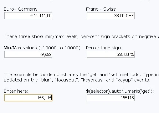
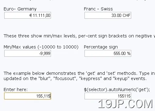 简易数字和货币格式库 autoNumeric