最新资源


简介
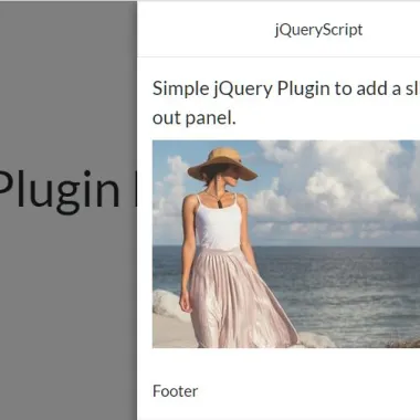
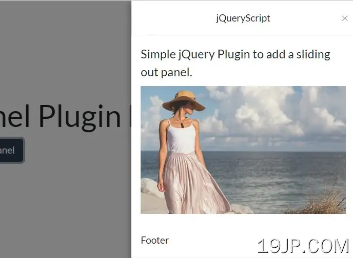
一个多用途、高度可定制、移动友好的抽屉(滑出面板)插件,专为画布外菜单、侧边栏导航、设置面板、反馈表单等设计。
特征:
- 当抽屉打开时,推动或覆盖主要内容。
- 从屏幕的左侧/右侧/顶部/底部滑出。
- 基于CSS3的平滑和高性能转换。
- 自定义抽屉关闭图标。
- 您也可以单击背景覆盖或按ESC键关闭抽屉。
如何使用它:
1.首先,在页面上包含jQuery库和SlideOutPanel插件的文件。
- <link href="/path/to/dist/css/slide-out-panel.css" rel="stylesheet" />
- <script src="/path/to/cdn/jquery.slim.min.js"></script>
- <script src="/path/to/dist/js/slide-out-panel.js"></script>
2.然后将内容(页眉/正文/页脚)插入抽屉面板。
- <div id="slide-out-panel" class="slide-out-panel">
- <header>Header</header>
- <section>Body</section>
- <footer>Footer</footer>
- </div>
3.Finnaly,调用函数滑出面板在顶部容器上,我们完成了。
- const slideOutPanel = $('#slide-out-panel').SlideOutPanel({
- // settings here
- });
4.在需要时打开、关闭或拨动抽屉。
- slideOutPanel.open();
- slideOutPanel.close();
- slideOutPanel.toggle();
5.确定触发时抽屉从哪个位置滑出。默认值:“right”。
- const slideOutPanel = $('#slide-out-panel').SlideOutPanel({
- slideFrom: 'left' // or 'right', 'top', 'bottom'
- });
6.确定当抽屉被触发时是否将主体推向另一侧。默认值:false。
- const slideOutPanel = $('#slide-out-panel').SlideOutPanel({
- bodyPush: true,
- breakpoint: '768px' // disable bodyPush on mobile
- });
7.确定是否允许ESC键关闭抽屉。默认值:false。
- const slideOutPanel = $('#slide-out-panel').SlideOutPanel({
- enableEscapeKey: true
- });
8.自定义关闭按钮。
- const slideOutPanel = $('#slide-out-panel').SlideOutPanel({
- closeBtn: '<i class="fas fa-times"></i>',
- closeBtnSize: '14px'
- });
9.打开抽屉时自定义背景覆盖。
- const slideOutPanel = $('#slide-out-panel').SlideOutPanel({
- screenClose: true,
- screenOpacity: '0.5',
- screenZindex: '9998',
- showScreen: true
- });
10.设置与页面顶部的距离。默认值:0。
- const slideOutPanel = $('#slide-out-panel').SlideOutPanel({
- offsetTop: 0
- });
11.自定义抽屉的宽度。默认值:“350px”。
- const slideOutPanel = $('#slide-out-panel').SlideOutPanel({
- width: '300px'
- });
12.配置打开/关闭转换。
- const slideOutPanel = $('#slide-out-panel').SlideOutPanel({
- transition: 'ease',
- transitionDuration: '0.35s',
- });
13.事件处理程序。
- const slideOutPanel = $('#slide-out-panel').SlideOutPanel({
- afterClosed() {},
- afterOpen() {},
- beforeClosed() {},
- beforeOpen() {},
- rendered() {},
- });
14.销毁抽屉。
- slideOutPanel.destroy();
更新日志:
2022-01-23
- 更新包和编译
预览截图
 多功能边栏抽屉插件 SlideOutPanel