最新资源


简介
iziModal是一个简单、快速的jQuery插件,可以使用CSS3提供的过渡效果创建响应迅速、美观、高度可定制的模式窗口。
更多功能:
- 自定义模态标题和副标题。
- 允许自定义模式图标。
- 支持iFrame和AJAX。
- ESC键关闭模式。
- 打开时自动聚焦在第一个输入上。
- 页面加载时自动打开。
- 自定义过渡效果。
- 有很多选项和API。
查看更多模态插件,网址:
- 前50个Modal jQuery插件
如何使用它:
1.要使用此插件,请确保包含iziModal.min.css和iziModal.min.js模式在网页上。
- <link href="iziModal.min.css" rel="stylesheet" type="text/css">
- <script src="//code.jquery.com/jquery.min.js"></script>
- <script src="iziModal.min.js"></script>
2.在网页上包含您选择的图标字体(可选)。
- <link rel="stylesheet" href="http://netdna.bootstrapcdn.com/font-awesome/4.6.2/css/font-awesome.min.css">
3.将您的内容插入到一个DIV元素中,该元素的CSS类为“iziModal”。
- <div id="modal-demo" class="iziModal">
- Custom content here
- </div>
4.创建一个链接来切换模态。
- <a href="#" class="trigger-link">Click Me</a>
5.使用选项初始化模态。
- $("#modal-demo").iziModal({
- // options here
- });
6.在网页上显示模态。
- $(document).on('click', '.trigger-link', function (event) {
- event.preventDefault();
- $('#modal-demo').iziModal('open');
- });
7.所有默认选项。下面列出的选项也可以通过数据iziModal optionName属性使用。
- $("#modal-demo").iziModal({
- title: '',
- subtitle: '',
- headerColor: '#88A0B9',
- background: null,
- theme: '', // light
- icon: null,
- iconText: null,
- iconColor: '',
- rtl: false,
- width: 600,
- top: null,
- bottom: null,
- borderBottom: true,
- padding: 0,
- radius: 3,
- zindex: 999,
- iframe: false,
- iframeHeight: 400,
- iframeURL: null,
- focusInput: true,
- group: '',
- loop: false,
- arrowKeys: true,
- navigateCaption: true,
- // Boolean, 'closeToModal', 'closeScreenEdge'
- navigateArrows: true,
- history: false,
- restoreDefaultContent: false,
- // Boolean, Number
- autoOpen: 0,
- bodyOverflow: false,
- fullscreen: false,
- openFullscreen: false,
- closeOnEscape: true,
- closeButton: true,
- appendTo: 'body', // or false
- appendToOverlay: 'body', // or false
- overlay: true,
- overlayClose: true,
- overlayColor: 'rgba(0, 0, 0, 0.4)',
- timeout: false,
- timeoutProgressbar: false,
- pauseOnHover: false,
- timeoutProgressbarColor: 'rgba(255,255,255,0.5)',
- // comingIn, bounceInDown, bounceInUp, fadeInDown
- // fadeInUp, fadeInLeft, fadeInRight, flipInX
- // bounceInLeft, bounceInRight
- transitionIn: 'comingIn',
- // comingOut, bounceOutDown, bounceOutUp, fadeOutDown
- // fadeOutUp, , fadeOutLeft, fadeOutRight, flipOutX
- // bounceOutLeft, bounceOutRight
- transitionOut: 'comingOut',
- transitionInOverlay: 'fadeIn',
- transitionOutOverlay: 'fadeOut',
- // callback functions
- onFullscreen: function(){},
- onResize: function(){},
- onOpening: function(){},
- onOpened: function(){},
- onClosing: function(){},
- onClosed: function(){},
- afterRender: function(){}
- });
8.API方法。
- // Open
- $('#modal-demo').iziModal('open');
- // Close
- $('#modal-demo').iziModal('close');
- // Change to the opposite of the current state.
- $('#modal').iziModal('toggle');
- // Returns group information.
- $('#modal').iziModal('getGroup');
- // Set a new group name.
- $('#modal').iziModal('setGroup', 'alerts');
- // Skip to next modal to the same group.
- $('#modal').iziModal('next');
- // Skip to previous modal to the same group.
- $('#modal').iziModal('prev');
- // getState
- /**
- * @returns {'closed'|'closing'|'opened'|'opening'}
- */
- $('#modal-demo').iziModal('getState');
- // startLoading
- $('#modal-demo').iziModal('startLoading');
- // stopLoading
- $('#modal-demo').iziModal('stopLoading');
- // Destroy
- $('#modal-demo').iziModal('destroy');
- // Start progress loading within the modal.
- $('#modal').iziModal('startProgress');
- // Pause progress loading within the modal.
- $('#modal').iziModal('pauseProgress');
- // ProgressResume progress loading within the modal.
- $('#modal').iziModal('resumeProgress');
- // Reset progress loading within the modal.
- $('#modal').iziModal('resetProgress');
- // setHeaderColor
- $('#modal-demo').iziModal('setHeaderColor', 'color');
- // setTitle
- $('#modal-demo').iziModal('setTitle', 'Title');
- // setSubtitle
- $('#modal-demo').iziModal('setSubtitle', 'Subtitle');
- // setIconClass
- $('#modal-demo').iziModal('setIconClass', 'iconClass');
- // Change the class of icon.
- $('#modal').iziModal('setIcon', 'iconClass');
- // Change the text of font icon.
- $('#modal').iziModal('setIconText', 'icon');
- // Change the z-index CSS attribute of the modal.
- $('#modal').iziModal('setZindex', 999);
- // Change the Modal opening transition.
- $('#modal').iziModal('setTransitionIn', 'comingIn');
- // Change the Modal closing transition.
- // comingOut, bounceOutDown, bounceOutUp, fadeOutDown, fadeOutUp, , fadeOutLeft, fadeOutRight, flipOutX
- $('#modal').iziModal('setTransitionOut', 'comingOut');
- // recalculateLayout
- $('#modal-demo').iziModal('recalculateLayout');
- // Set a new content to modal.
- $('#modal').iziModal('setContent', '<p>Example</p>');
- // Returns the default Modal content.
- $('#modal').iziModal('resetContent');
9.事件。
- // Opening
- $(document).on('opening', '#modal-demo', function (e) {
- // ...
- });
- // Opened
- $(document).on('opened', '#modal-demo', function (e) {
- // ...
- });
- // Closing
- $(document).on('closing', '#modal-demo', function (e) {
- // ...
- });
- // Closed
- $(document).on('closed', '#modal-demo', function (e) {
- // ...
- });
- // if is fuulscreen
- $(document).on('fullscreen', '#modal-default', function (e, modal) {
- if(modal.isFullscreen){
- // Enabled
- } else {
- // Disabled
- }
- });
- // Capture when a modal opens and closes within a group.
- $(document).on('iziModal-group-change', function (e, modal) {
- console.info(modal.in); // Modal that came in.
- console.info(modal.out); // Modal that came out.
- });
更新日志:
v1.6.1 (2022-05-30)
- 安全补丁。
v1.6.0 (2022-05-23)
- 新-jQuery 3就绪
- 新-数据iziModal preventClose
- 新增-startProgress、pauseProgress、resumeProgress和resetProgress方法
- 新增-打开多个模式
- NEW-arrowKeys选项可启用/禁用
- 新增-默认为“边框”
- 已修复Bug
v1.5.1(2018年01月06日)
- 添加:appendToOverlay选项
- 添加:afterRender选项
- 添加:setContent方法
- 添加:resetContent方法
- 修正:模式在一定时间后自动关闭
- 已修复:URL更改时模式自动关闭
- 已修复:全屏
- 固定:打开和关闭功能
- 已修复:模式哈希
v1.5.0 (2017-06-06)
- 新数据iziModalopen=“#modal”用于任何选择器-已实现
- 新borderBottom选项-已实施
- 不再需要模态的新Div标签-已实现
- 新的AMD支持-已实施
- 新的setFullscreen方法-已实现
- 新的setWidth方法-已实现
- 新的setTop和setBottom方法-已实现
- 新的关闭按钮选项-已实施
- 新的appendTo选项-已实现
- 新的静态余量(顶部和底部选项)-已实施
- 新命名空间-已实现
- 在flexbox布局中使用Modal时的新改进-已实施
- BUG IE水平对齐(包括%)-固定
- iOS上的BUG Scroll iframe-已修复
- BUG隐藏导航箭头不起作用-已修复
- BUG某些类型的数据属性不能正常工作-已修复
- BUG与izToast动画不兼容-已修复
- BUG方法setTransitionIn和setTransitionOut-已修复
- BUG Modal在使用快捷箭头时关闭-已修复
- BUG Modal在关闭时会丢失类-已修复
- BUG Modal在关闭时失去选项RTL-已修复
- BUG Modal如果没有ID,则会丢失引用-已修复
v1.4.2 (2017-02-10)
- 所有选项现在都可以通过数据iziModal optionName属性使用
- 修正了alt文本模式高度计算不准确的问题
- 修复了替换文本浅色主题应用不正确的问题
- CSS更新
- 将命名空间添加到文档事件和窗口事件
v1.4.0 (2016-12-08)
- RTL支持-已实施。
- WAI-ARIA支持-已实施。
- 如果存在不属于模态的哈希,则会发生错误-已修复。
- 如果缺少“iziModal”类,它会破坏布局-已修复。
- 模态的垂直定位,有时应用不正确-已修复。
- 模态定位的转换行为不正确-已修复。
- 模态组导航无法正常工作如果任何模态被破坏-已修复。
- 转换此的浮点值$element.innerHeight()转换为整数以防止错误
v1.3.3 (2016-09-06)
- 添加:文本图标支持(选项、数据属性和设置方法)。
- 修正了:alt文本历史记录在手机上始终处于活动状态。
- 已修复:alt-text无法同时实例化多个模态。
v1.3.2(2016年8月10日)
- setGroup以设置新的组名称-已实现。
- alt文本组选项在某些情况下有效-已修复。
v1.3.1 (2016-08-09)
- iframe URL(通过类似点击的事件)不适用于附加子项-已修复。
- 带百分比的alt文本宽度不起作用-已修复。
v1.3.0(2016年8月04日)
- 历史支持。
- 具有标题和导航的组支持(数据iziModal组)。
- 方法next和prev将在组模式中使用。
- 选项循环和数据(数据iziModal循环)。
- 选项pauseOnHover(当您超时时)。
- CSS中的其他转换和改进。
- 方法setTransitionIn和setTransitionOut。
- 数据iziModal transitionIn和数据iziModal transitionOut到触发器和模态。
- radius选项、zindex选项和方法集zindex。
- 打开和关闭方法它们可以用于不同的动画。
- data iziModal open=“模态id”。
- 数据iziModal标题、数据iziModal字幕和数据iziMode图标。
- 回调onResize和onFullscreen。
- 事件全屏和全局事件iziModal组更改。
- 带延迟的自动打开选项。
- 附加选项,顶部或底部。
- 方法的返回总是被覆盖-已修复。
- 全屏溢出和js结构中的其他小修复-已修复。
2016-07-22
- JS更新。
2016-07-21
- 视网膜显示支持
- 修复:回调无法访问模态函数
2016-07-19
- 应用全屏的新功能
- 带有进度条的新超时功能
2016-07-14
- 关闭覆盖仅在第一时间起作用
2016-07-10
- JS更新
Â
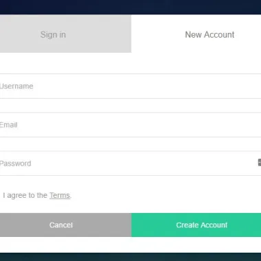
预览截图
 响应式CSS3动画jQuery模态插件 iziModal