
最新资源


简介
MagicSuggest是一个易于使用的jQuery插件,用于创建一个组合列表,使您能够从下拉列表中选择多个项目(例如标签、令牌、电子邮件地址等),并支持打字和自动完成。
更多功能:
- 响应式设计。
- 与Bootstrap 3和Bootstrap 4框架兼容。
- 通过AJAX动态加载数据。
- 自定义查询参数。
- 数据排序和过滤。
- 复杂的模板。
- 大量配置选项。
基本用法:
1.在网页的头部加载jQueryMagicSugest插件的CSS和Bootstrap的样式表。
<link rel="stylesheet" href="/path/to/cdn/bootstrap.min.css" />
<link href="magicsuggest.css" rel="stylesheet" />
2.创建一个空容器,您想在其中生成组合列表。
<div id="example" class="form-control"></div>
3.在文档末尾加载jQuery JavaScript库和jQuery MagicSuguest插件的JavaScript。
<script src="/path/to/cdn/jquery.min.js"></script>
<script src="magicsuggest.js"></script>
4.准备用于填充组合框的JSON数据。这里有3个选项:
- 无数据源(默认):如果留空,组合框将不会显示任何内容。如果allowFreeEntries被*设置为true(默认值),它仍然可以让用户输入多个条目。
- 静态来源:您可以传递一个JSON对象数组、一个字符串数组,甚至一个CSV字符串作为数据源。例如数据:[*{id:0,name:“Paris”},{id:1,name:”New York“}]。您还可以传递任何带有results属性的json对象,该属性包含json数组。
- 网址:您可以传递url,组件将从中获取JSON数据。数据将使用POST ajax请求获取,该请求将*包括输入的文本作为“query”参数
- 功能:您可以传递一个返回JSON对象数组的函数(例如:〔{id:…,name:…},{…}〕)。该函数可以返回JSON数据,也可以使用第一个参数作为函数来处理数据。函数成功只需要一个(回调函数或返回值)。
var myData = ['New York','Los Angeles','Chicago', ...]
5.初始化jQuery MagicSuggest插件,并用您自己的数据填充组合列表。
$(function() {
  var instance = $('#example').magicSuggest({
    data: myData
  });
});
6.使用自定义模板提供作用
$(function() {
  var instance = $('#example').magicSuggest({
    data: myData,
    renderer: function(data){
      return '<div style="padding: 5px; overflow:hidden;">' +
          '<div style="float: left;"><img src="' + data.picture + '" /></div>' +
          '<div style="float: left; margin-left: 5px">' +
              '<div style="font-weight: bold; color: #333; font-size: 10px; line-height: 11px">' + data.name + '</div>' +
              '<div style="color: #999; font-size: 9px">' + data.email + '</div>' +
          '</div>' +
      '</div><div style="clear:both;"></div>'; // make sure we have closed our dom stuff
    }
  });
});
7.所有默认配置选项、功能和回调。
/**********  CONFIGURATION PROPERTIES ************/
/**
 * Restricts or allows the user to validate typed entries.
 * Defaults to true.
 */
allowFreeEntries: true,

/**
 * Restricts or allows the user to add the same entry more than once
 * Defaults to false.
 */
allowDuplicates: false,

/**
 * Additional config object passed to each $.ajax call
 */
ajaxConfig: {},

/**
 * If a single suggestion comes out, it is preselected.
 */
autoSelect: true,

/**
 * Auto select the first matching item with multiple items shown
 */
selectFirst: false,

/**
 * Allow customization of query parameter
 */
queryParam: 'query',

/**
 * A function triggered just before the ajax request is sent, similar to jQuery
 */
beforeSend: function(){ },

/**
 * A custom CSS class to apply to the field's underlying element.
 */
cls: '',

/**
 * JSON Data source used to populate the combo box. 3 options are available here:
 * No Data Source (default)
 *    When left null, the combo box will not suggest anything. It can still enable the user to enter
 *    multiple entries if allowFreeEntries is * set to true (default).
 * Static Source
 *    You can pass an array of JSON objects, an array of strings or even a single CSV string as the
 *    data source.For ex. data: [* {id:0,name:"Paris"}, {id: 1, name: "New York"}]
 *    You can also pass any json object with the results property containing the json array.
 * Url
 *     You can pass the url from which the component will fetch its JSON data.Data will be fetched
 *     using a POST ajax request that will * include the entered text as 'query' parameter. The results
 *     fetched from the server can be:
 *     - an array of JSON objects (ex: [{id:...,name:...},{...}])
 *     - a string containing an array of JSON objects ready to be parsed (ex: "[{id:...,name:...},{...}]")
 *     - a JSON object whose data will be contained in the results property
 *      (ex: {results: [{id:...,name:...},{...}]
 * Function
 *     You can pass a function which returns an array of JSON objects  (ex: [{id:...,name:...},{...}])
 *     The function can return the JSON data or it can use the first argument as function to handle the data.
 *     Only one (callback function or return value) is needed for the function to succeed.
 *     See the following example:
 *     function (response) { var myjson = [{name: 'test', id: 1}]; response(myjson); return myjson; }
 */
data: null,

/**
 * Additional parameters to the ajax call
 */
dataUrlParams: {},

/**
 * Start the component in a disabled state.
 */
disabled: false,

/**
 * Name of JSON object property that defines the disabled behaviour
 */
disabledField: null,

/**
 * Name of JSON object property displayed in the combo list
 */
displayField: 'name',

/**
 * Set to false if you only want mouse interaction. In that case the combo will
 * automatically expand on focus.
 */
editable: true,

/**
 * Set starting state for combo.
 */
expanded: false,

/**
 * Automatically expands combo on focus.
 */
expandOnFocus: false,

/**
 * JSON property by which the list should be grouped
 */
groupBy: null,

/**
 * Set to true to hide the trigger on the right
 */
hideTrigger: false,

/**
 * Set to true to highlight search input within displayed suggestions
 */
highlight: true,

/**
 * A custom ID for this component
 */
id: null,

/**
 * A class that is added to the info message appearing on the top-right part of the component
 */
infoMsgCls: '',

/**
 * Additional parameters passed out to the INPUT tag. Enables usage of AngularJS's custom tags for ex.
 */
inputCfg: {},

/**
 * The class that is applied to show that the field is invalid
 */
invalidCls: 'ms-inv',

/**
 * Set to true to filter data results according to case. Useless if the data is fetched remotely
 */
matchCase: false,

/**
 * Once expanded, the combo's height will take as much room as the # of available results.
 *    In case there are too many results displayed, this will fix the drop down height.
 */
maxDropHeight: 290,

/**
 * Defines how long the user free entry can be. Set to null for no limit.
 */
maxEntryLength: null,

/**
 * A function that defines the helper text when the max entry length has been surpassed.
 */
maxEntryRenderer: function(v) {
    return 'Please reduce your entry by ' + v + ' character' + (v > 1 ? 's':'');
},

/**
 * The maximum number of results displayed in the combo drop down at once.
 */
maxSuggestions: null,

/**
 * The maximum number of items the user can select if multiple selection is allowed.
 *    Set to null to remove the limit.
 */
maxSelection: 10,

/**
 * A function that defines the helper text when the max selection amount has been reached. The function has a single
 *    parameter which is the number of selected elements.
 */
maxSelectionRenderer: function(v) {
    return 'You cannot choose more than ' + v + ' item' + (v > 1 ? 's':'');
},

/**
 * The method used by the ajax request.
 */
method: 'POST',

/**
 * The minimum number of characters the user must type before the combo expands and offers suggestions.
 */
minChars: 0,

/**
 * A function that defines the helper text when not enough letters are set. The function has a single
 *    parameter which is the difference between the required amount of letters and the current one.
 */
minCharsRenderer: function(v) {
    return 'Please type ' + v + ' more character' + (v > 1 ? 's':'');
},

/**
 * Whether or not sorting / filtering should be done remotely or locally.
 * Use either 'local' or 'remote'
 */
mode: 'local',

/**
 * The name used as a form element.
 */
name: null,

/**
 * The text displayed when there are no suggestions.
 */
noSuggestionText: 'No suggestions',

/**
 * The default placeholder text when nothing has been entered
 */
placeholder: 'Type or click here',

/**
 * A function used to define how the items will be presented in the combo
 */
renderer: null,

/**
 * Whether or not this field should be required
 */
required: false,

/**
 * Set to true to render selection as a delimited string
 */
resultAsString: false,

/**
 * Text delimiter to use in a delimited string.
 */
resultAsStringDelimiter: ',',

/**
 * Name of JSON object property that represents the list of suggested objects
 */
resultsField: 'results',

/**
 * A custom CSS class to add to a selected item
 */
selectionCls: '',

/**
 * An optional element replacement in which the selection is rendered
 */
selectionContainer: null,

/**
 * Where the selected items will be displayed. Only 'right', 'bottom' and 'inner' are valid values
 */
selectionPosition: 'inner',

/**
 * A function used to define how the items will be presented in the tag list
 */
selectionRenderer: null,

/**
 * Set to true to stack the selectioned items when positioned on the bottom
 *    Requires the selectionPosition to be set to 'bottom'
 */
selectionStacked: false,

/**
 * Direction used for sorting. Only 'asc' and 'desc' are valid values
 */
sortDir: 'asc',

/**
 * name of JSON object property for local result sorting.
 *    Leave null if you do not wish the results to be ordered or if they are already ordered remotely.
 */
sortOrder: null,

/**
 * If set to true, suggestions will have to start by user input (and not simply contain it as a substring)
 */
strictSuggest: false,

/**
 * Custom style added to the component container.
 */
style: '',

/**
 * If set to true, the combo will expand / collapse when clicked upon
 */
toggleOnClick: false,


/**
 * Amount (in ms) between keyboard registers.
 */
typeDelay: 400,

/**
 * If set to true, tab won't blur the component but will be registered as the ENTER key
 */
useTabKey: false,

/**
 * If set to true, using comma will validate the user's choice
 */
useCommaKey: true,


/**
 * Determines whether or not the results will be displayed with a zebra table style
 */
useZebraStyle: false,

/**
 * initial value for the field
 */
value: null,

/**
 * name of JSON object property that represents its underlying value
 */
valueField: 'id',

/**
 * regular expression to validate the values against
 */
vregex: null,

/**
 * type to validate against
 */
vtype: null
8.API方法。
var instance = $('#example').magicSuggest({
    // options here
  });


// adds items to the selection
instance.addToSelection([object] objs, [boolean] silent)

// clears the selection
instance.clear([boolean] silent)

// collapses the combo list
instance.collapse([boolean] silent)

// disables the combo list
instance.disable()

// removes what the user was typing
instance.empty()

// enables the compolist
instance.enable()

// expands the component
instance.expand()

// returns the combo suggestions
instance.getData()

// returns the status of the component
instance.isDisabled()

// checks if the selection is valid
instance.isValid()

// returns the list of extra URL paramaters set for AJAX requests
instance.getDataUrlParams()

// returns the name used for HTML form submission
instance.getName()

// returns an array of selected JSON objects
instance.getSelection()

// returns the current text being entered by the user
instance.getRawValue()

// returns an array containing only the selected JSON values
instance.getValue()

// removes items from the selection
instance.removeFromSelection([object] objs, [boolean] silent)

// sets the objects listed in the combo
instance.setData([array] cbItems)

// sets the name to be used for form submission
instance.setName([string] name)

// sets the selection with a given array of objects
instance.setSelection(object[])

// sets the selection according to given values
instance.setValue([array] ids)

// sets extra parameters for AJAX requests
instance.setDataUrlParams([object] params)
9.事件。
var instance = $('#example').magicSuggest({
    // options here
  });

instance.on( "beforeload", function(e, this) {
  // fired before the AJAX request is performed
});

instance.on( "blur", function(e, this) {
  // fired when the component looses focus
});

instance.on( "collapse", function(e, this) {
  // fired when the combo is collapsed
});

instance.on( "expand", function(e, this) {
  // fired when the combo is expanded
});

instance.on( "focus", function(e, this) {
  // fired when the combo gains focus
});

instance.on( "keydown", function(e, this, keyevent) {
  // fired when the user presses a key
});

instance.on( "keyup", function(e, this, keyevent) {
  // fired when the user releases a key
});

instance.on( "load", function(e, this, records[]) {
  // fired when the AJAX request has been performed
});

instance.on( "selectionchange", function(e, this, records[]) {
  // fired when the user has changed the selection
});

instance.on( "triggerclick", function(e, this) {
  // fired when the user has changed the selection
});
更新日志:
v2.1.6版本(2022-04-01)
- 不清除为SHIFT触发关键帧设置事件的时间
- 已修复:在输入时禁用任意HTML和SCRIPT执行。
- 处理attr(“class”)未定义的情况
v2.1.5版本(2020-10-31)
- 前置关闭按钮,而不是附加它。
- 使用当前主代码更新了magicsuggest-min.js
- 动态更新最大选择大小
2020-10-30
- 已更新精简版
2020-10-15
- 添加了一个功能,可以动态更新最大选择大小。它通过将列表向下截断到新的大小来处理比所选内容小的新大小。
2020-10-08
- 准备关闭按钮而不是附加它
预览截图
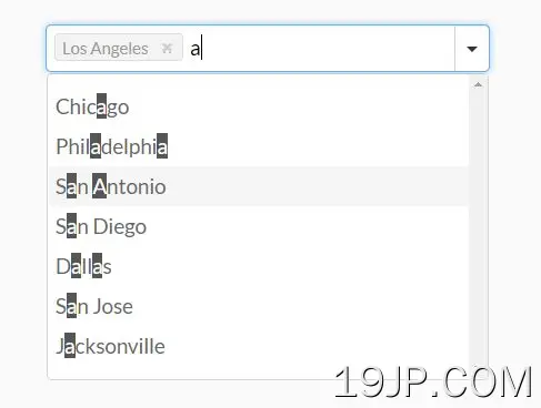 jQuery 简单响应多选插件 MagicSuggest