最新资源


简介
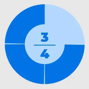
另一个圆形进度条插件,用于在响应式、可自定义的动画百分比/进度图中显示任何数值:圆形、环形图、饼图等。
更多功能:
- 通过JavaScript和CSS进行完全自定义。
- 基于SVG的矢量形状。
- 顺时针或逆时针旋转。
- 具有轻松功能的花式填充动画。
- 6种数值显示模式。
- 也可以用作普通的JavaScript插件。
参见:
- 最佳循环/径向进度条JavaScript插件
如何使用它:
1.在文档中加载Circle Progress插件的脚本。要将Circle Progress用作jQuery插件,请确保加载jquery.circle-progress.min.js查询在最新的jQuery JavaScript库之后。
<!-- Vanilla JavaScript -->
<script src="dist/circle-progress.min.js"></script>

<!-- jQuery -->
<script src="https://code.jquery.com/jquery-3.4.1.min.js"></script>
<script src="dist/jquery.circle-progress.min.js"></script>
2.创建一个空容器来容纳百分比/进度圆圈。
<div class="progress"></div>
3.初始化插件并指定当前/最大值,如下所示:
// Vanilla JavaScript
new CircleProgress('.progress', {
  max: 100,
  value: 50
});

// jQuery
$('.progress').circleProgress({
  max: 100,
  value: 50
});
4.使用以下CSS类自定义百分比/进度圆的样式。
.circle-progress-svg {
  /*
    width: 200px;
    height: auto;
    ...
   */
}

.circle-progress-circle {
  /*
    stroke-width: 6px;
    stroke: hsl(39, 100%, 85%);
    ...
   */
}

.circle-progress-value {
  /*
    stroke-width: 6px;
    stroke: hsl(39, 100%, 50%);
    ...
  */
}

.circle-progress-text {
  /*
    fill: hsl(39, 100%, 50%);
    ...
  */
}

.circle-progress-text-value {
  /*
    fill: red;
    ...
  */
}

.circle-progress-text-max {
  /*
    fill: red;
    ...
  */
}
5.设置值的文本表示形式:
- 水平(默认)
- 竖的
- 百分比
- 价值
- 圆圈上的值
- 没有一个
new CircleProgress('.progress', {
    textFormat: 'horizontal'
});
6.自定义填充动画。
new CircleProgress('.progress', {

    // linear, easeInQuad, easeOutQuad, easeInOutQuad, easeInCubic, easeOutCubic, easeInOutCubic, easeInQuart, easeOutQuart, easeInOutQuart, easeInQuint, easeOutQuint, easeInOutQuint, easeInSine, easeOutSine, easeInOutSine, easeInExpo, easeOutExpo, easeInOutExpo, easeInCirc, easeOutCirc, easeInOutCirc, or none
    animation: 'easeInOutCubic',

    // duration in milliseconds
    animationDuration: 600

});
7.以度为单位设置起始角度。默认值:0。
new CircleProgress('.progress', {
    startAngle: 45
});
8.更多具有默认值的配置选项。
new CircleProgress('.progress', {

    // min value
    min: 0,

    // false = anti-clockwise
    clockwise: true,

    // whether the value should be constrained between min and max
    constrain: true,

    // indeterminate text
    indeterminateText, '?'

});
更新日志:
版本0.2.4(2022-05-16)
- 固定值OnCircle的文本值,并且没有动画
版本0.2.3(2022-03-13)
- 错误修复
版本0.2.2(2022-01-16)
- 支持NPM。
版本0.2.0(2020-08-23)
- 添加UMD支持
版本0.1.2(2020-05-02)
- 替换SVG innerHTML polyfill
版本0.1.1(2020-04-27)
- 扩展动画功能
版本0.1.0(2019-10-05)
- 将CSS类添加到SVG元素
预览截图
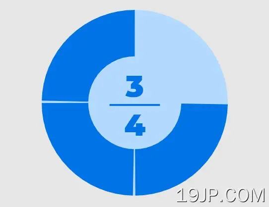 将百分比/进度值显示为仪表 圈进度