最新资源


简介
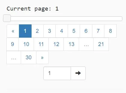
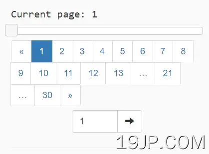
Pagination.js是一个轻量级但可定制的jQuery插件,用于使用Bootstrap 4或Bootstrap 3分页组件和jQuery UI对大型数据集进行分页。
主要特点:
- 基于引导分页组件。
- 使用jQuery UI支持分页滑块。
- 每次页面点击的回调功能。
- 允许设置要显示的最大页数。
- 大量API。
安装:
# NPM
$ npm install s-pagination --save
基本用法:
1.在网页中加载jQuery库和其他所需的JS/CSS文件。
<link rel="stylesheet" href="/path/to/bootstrap.min.css">
<link rel="stylesheet" href="/path/to/jquery-ui.css">
<script src="/path/to/jquer.min.js" ></script>
<script src="/path/to/jquery-ui.min.js"></script>
2.在页面中下载并加载jQuery Pagination.js插件的文件。
<link rel="stylesheet" href="dist/pagination.css">
<script src="dist/pagination.js"></script>
3.创建一个空容器,在该容器上放置分页。
<div id="pagination-demo"></div>
4.在您创建的容器中呈现默认分页的JavaScript。
var myPagination = new Pagination({
    container: $("#pagination-demo")
});
5.呈现指定项目计数和页面大小的分页。
var itemsCount = 300;
var itemsOnPage = 10;

var myPagination = new Pagination({
    container: $("#pagination-demo")
});

myPagination.make(itemsCount, itemsOnPage);
6.默认配置选项。
var myPagination = new Pagination({

    // Where to render this component
    container: '',

    // Called when user change page by this component
    // contains one parameter with page number
    pageClickCallback: function(){},

    // The URL to which is browser redirected after user change page by this component
    pageClickUrl: '',

    // If true, pageClickCallback is called immediately after component render (after make method call)
    callPageClickCallbackOnInit: false,

    // The number of visible buttons in pagination panel
    maxVisibleElements: 13,

    // Shows slider for fast navigation between pages
    showSlider: false,

    // Shows text input box for direct navigation to specified page
    showInput: false,

    // The content of tooltip displayed on text input box.
    inputTitle: '',

    // If false, standard mode is used (show arrows on the edges, border page numbers, shorting dots and page numbers around current page).
    // If true, standard mode is enhanced, so page number between border number and middle area is also displayed.
    enhancedMode: false

});
7.API方法。
// Render the component for specified items count and page size.
// DefaultPageNumber parameter is optional and sets active page.
myPagination.make(itemsCount, itemsOnPage, defaultPageNumber)

// Force "Go to page" action. Component is rerendered to specified page and actions (pageClickCallback, pageClickUrl) are invoked.
myPagination.goToPage(pageNumber)

// Returns current page count.
myPagination.getPageCount()

// Returns current page number.
myPagination.getCurrentPage()
更新日志:
2022-10-11
- v3.0.0:修复了将默认箭头附加到“goToButtonLabel”
2022-02-18
- 2.0版本
2022-01-20
- 添加缺少的容器类型选项
2019-03-07
- v2.1.0版本
2018-09-27
- 删除bower,修复与bootstrap 4的兼容性,添加依赖项,更新包版本
2018-01-10
- 在init上调用回调的选项已移动到Options对象
预览截图
 方便 分页插件,带Bootstrap 3/4和jQuery UI 分页.js