最新资源


简介
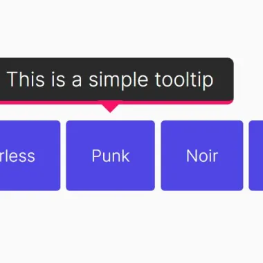
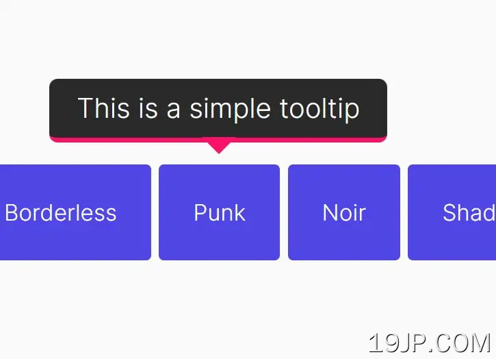
Tooltipster是一个干净、轻量级的jQuery Tooltip插件,用于在任何DOM元素上创建极其灵活、经过HTML5验证、支持触摸的工具提示。
更多功能:
- 5个很棒的动画。
- 5个内置主题。
- 如果在视口外滚动,则自动重新定位工具提示。
- 支持HTML工具提示内容。
- 允许在单个元素上使用多个工具提示。
- 自定义触发器事件。不仅仅是悬停。
安装:
# NPM
$ npm install tooltipster

# Bower
$ bower install tooltipster
如何使用它:
1.在文档中包含必要的JavaScript和CSS文件。
<!-- Core Stylesheet -->
<link rel="stylesheet" href="/path/to/dist/css/tooltipster.bundle.min.css" />

<!-- OPTIONAL Themes -->
<link rel="stylesheet" href="/path/to/dist/css/plugins/tooltipster/sideTip/themes/tooltipster-sideTip-borderless.min.css" />
<link rel="stylesheet" href="/path/to/dist/css/plugins/tooltipster/sideTip/themes/tooltipster-sideTip-light.min.css" />
<link rel="stylesheet" href="/path/to/dist/css/plugins/tooltipster/sideTip/themes/tooltipster-sideTip-noir.min.css" />
<link rel="stylesheet" href="/path/to/dist/css/plugins/tooltipster/sideTip/themes/tooltipster-sideTip-punk.min.css" />
<link rel="stylesheet" href="/path/to/dist/css/plugins/tooltipster/sideTip/themes/tooltipster-sideTip-shadow.min.css" />

<!-- jQuery -->
<script src="/path/to/cdn/jquery.slim.min.js"></script>

<!-- JavaScript -->
<script src="/path/to/dist/js/tooltipster.bundle.min.js"></script>
2.根据您的需要加载工具提示插件:
- 支持向量:添加SVG支持
- 发现:允许工具提示组
- 追随者:使工具提示跟随光标
- 可滚动提示:帮助创建可滚动的工具提示
- 可选文本:选择/高亮显示某些文本时显示工具提示
<!-- SVG Plugin -->
<script src="./dist/js/plugins/tooltipster/SVG/tooltipster-SVG.min.js"></script>

<!-- Discovery Plugin -->
<script src="./tooltipster-discovery/tooltipster-discovery.min.js"></script>

<!-- Follower Plugin -->
<link rel="stylesheet" href="./tooltipster-follower/dist/css/tooltipster-follower.min.css" />
<script src="./tooltipster-follower/dist/js/tooltipster-follower.min.js"></script>

<!-- scrollableTip Plugin -->
<script src="./tooltipster-scrollableTip/tooltipster-scrollableTip.min.js"></script>

<!-- SelectableText Plugin-->
<script src="./tooltipster-selectableText/tooltipster-selectableText.js"></script>
3.使用默认选项调用插件。
$(document).ready(function() {
  $('.tooltip').tooltipster();
});4.将工具提示附加到指定的元素,并将自定义工具提示内容插入标题属性如下:
<a href="https://www.jqueryscript.net"
   class="tooltip"
   title="Tooltip Content Here">
   jQueryScript.Net
</a>
5.或者将任何内容加载到工具提示中:
<span class="tooltip" data-tooltip-content="#tooltip_content">
  Hover Me
</span>

<div class="tooltip_templates">
  <span id="tooltip_content">
    ANY HTML HERE
  </span>
</div>
.tooltip_templates {
display: none;
}$('.tooltip').tooltipster({
// if you have two tooltips that have the same data-tooltip-content attribute
contentCloning: true
});6.使用以下选项自定义工具提示。
// fade, grow, swing, slide, fall
animation: 'fade',

// Sets the duration of the animation, in milliseconds.
// If you wish to provide different durations for the opening and closing animations, provide an array of two different values.
animationDuration: 350,

// If set, this will override the content of the tooltip.
content: null,

// If the content of the tooltip is provided as a string,
// it is displayed as plain text by default.
contentAsHTML: false,

// If you provide a jQuery object to the 'content' option,
// this sets if it is a clone of this object that should actually be used.
contentCloning: true,

// Debug mode
debug: true,

// Delay how long it takes (in milliseconds) for the tooltip to start animating in.
delay: 200,

// Upon touch interaction, this is the delay before the tooltip starts its opening and closing animations when the 'hover' trigger is used (*).
// If you wish to specify different delays for opening and closing, you may provide an array of two different values.
delayTouch: [300, 500],

// fired only once at instantiation
functionInit: null

// fired before the tooltip opens
functionBefore: null

// fired when the tooltip and its contents have been added to the DOM.
functionReady: null

// fired once the tooltip has been closed and removed from the DOM.
functionAfter: null

// A custom function that does not modify the content but that can format it for display.
// It gets the two first usual arguments and also the content as third argument.
// It must return the value that will be displayed in the tooltip, either a string or a jQuery-wrapped HTML element.
functionFormat: null,

// The minimum version of Internet Explorer to run on.
IEmin: 6,

// Give users the possibility to interact with the tooltip.
interactive: false,

// Allows you to put multiple tooltips on a single element.
multiple: false,

// will default to document.body, or must be an element positioned at (0, 0)
// in the document, typically like the very top views of an app.
parent: null,

// The names of plugins to be used by Tooltipster.
plugins: ['sideTip'],

// Repositions the tooltip if it goes out of the viewport when the user scrolls the page, in order to keep it visible as long as possible.
repositionOnScroll: false,

// Specifies if a TITLE attribute should be restored on the HTML element after a call to the 'destroy' method.
// This attribute may be omitted, or be restored with the value that existed before Tooltipster was initialized, or be restored with the stringified value of the current content.
// Note: in case of multiple tooltips on a single element, only the last destroyed tooltip may trigger a restoration.
restoration: 'none',

// Sets if the tooltip should self-destruct after a few seconds when its origin is removed from the DOM.
// This prevents memory leaks.
selfDestruction: true,

// Set a theme that will override the default tooltip appearance.
// You may provide an array of strings to apply several themes at once (see the themes section).
// Default, Light, Borderless, Punk, Noir, Shadow
theme: [],

// How long (in ms) the tooltip should live before closing.
timer: 0,

// Sets how often the tracker should run (see trackOrigin and trackTooltip), in milliseconds.
// The tracker runs even if trackOrigin and trackTooltip are false to check if the origin has not been removed while the tooltip was open, so you shouldn't set too high or too low values unless you need to.
trackerInterval: 500,

// Repositions the tooltip if the origin moves or is resized. As this option may have an impact on performance, we suggest you enable it only if you need to.
trackOrigin: false,

// Repositions the tooltip if its size changes.
// When the size change results from a call to the 'content' method, the tooltip is already repositioned without the need to enable this option.
// As this option may have an impact on performance, we suggest you enable it only if you need to.
trackTooltip: false,

// Sets when the tooltip should open and close. 'hover' and 'click' correspond to predefined sets of built-in triggers, while 'custom' lets you create your own, for a completely customized behavior.
// click, mouseenter, touchstart, tap, click, mouseleave, originClick, scroll, tap, touchleave
trigger: 'hover',

triggerClose: {
  click: false,
  mouseleave: false,
  originClick: false,
  scroll: false,
  tap: false,
  touchleave: false
},

triggerOpen: {
  click: false,
  mouseenter: false,
  tap: false,
  touchstart: false
},

// Plays a subtle animation when the content of the tooltip is updated (if the tooltip is open).
// You may create custom animations in your CSS files.
// Set to null to disable the animation.
updateAnimation: 'rotate',

// Set the z-index of the tooltip.
zIndex: 9999999,

// mouse follower plugin options
minWidth: 0,
maxWidth: null,
offset: [15,-15],
// top-left, top-center, top-right, left-center
// left-right, bottom-left, bottom-center, bottom-right
anchor: 'top-left',
7.API方法。
// instance.methodName(arg);
// or $('element').tooltipster(methodName, arg);

instance.close([callback])
instance.content([myNewContent])
instance.destroy()
instance.disable()
instance.elementOrigin()
instance.elementTooltip()
instance.enable()
instance.instance()
instance.on()
instance.one()
instance.off()
instance.triggerHandler()
instance.open([callback])
instance.option(optionName [, optionValue])
instance.reposition()
instance.status()
8.事件。
// instance.on(event, function);
// or $.tooltipster.on(event, function);
instance
  .on('init', doSomething)
  .on('before', doSomething)
  .on('after', doSomething)
  .on('close', doSomething)
  .on('closing', doSomething)
  .on('created', doSomething)
  .on('destroy', doSomething)
  .on('destroyed', doSomething)
  .on('dismissable', doSomething)
  .on('format', doSomething)
  .on('geometry', doSomething)
  .on('state', doSomething)
  .on('ready', doSomething)
  .on('reposition', doSomething)
  .on('repositioned', doSomething)
  .on('scroll', doSomething)
  .on('start', doSomething)
  .on('startcancel', doSomething)
  .on('startend', doSomething)
  .on('updated', doSomething)
更新日志:
2022-05-24
- 更新文档
- 更新演示
2020-06-06
- v4.2.8:固定距离选项
2019-08-20
- v4.2.7:修复一个常见的JS问题
2018-01-30
- v4.2.7:修复一个常见的JS问题
2018-01-30
- 第4.2.6版
2017-04-29
- 已修复:无法读取null的属性“trigger”
2017-03-22
- 版本4.2.3
2017-03-05
- 环路固定
2017-03-04
- 自我毁灭时使用关闭动画
2017-01-22
- 已修复:读取“未定义”的“tagName”时失败。
2016-10-20
- 打开虚拟键盘时停止重新定位
2016-09-23
- 固定的工具提示器尺寸
2016-08-20
- 固定用于IE
2016-07-18
- 添加了数据工具提示内容属性
2016-07-09
- iOS8+修复
2016-06-22
- SVG修复
2016-06-14
- 使现代化
第3.3.0版(2014-11-12)
- 添加了closeOnClick和positionTrackerCallback选项
- 增加了恢复方法
第3.2.4版(2014-05-15)
- 赋予选项方法setter功能
第3.2.3版(2014-05-02)
- 删除fixedWidth,添加minWidth
第3.2.1版(2014-04-07)
- 在已具有非多重工具提示的元素上启动非多重工具时,记录警告而不是引发错误
第3.2.1版(2014-04-05)
- 调整了onlyOne选项,使其与multiple选项配合良好
第3.2.0版(2014-04-05)
- 实现了“multiple”选项
第3.1.4版(2014-03-20)
- 使现代化
第3.1.3版(2014-03-20)
- 区域目标的固定垂直定位
第3.1.2版(2014-03-18)
- 添加了一个回调参数来显示和隐藏API方法
v3.1.0(2014年2月25日)
- 添加了一个回调参数来显示和隐藏API方法
3.0.5版(2014-01-27)
- 错误的偏移错误修复
3.0.2版(2014-01-14)
- 错误的偏移错误修复
3.0.1版(2014-01-10)
- 版本更新
v3.0.0(2013年12月31日)
- 防止onlyOne关闭非自动关闭的工具提示
v2.2.3版本(2013-10-31)
- 修复了functionInit和损坏的缩小版本。
v2.2.2版本(2013-6-01)
- 修复各种错误并确认修复工具提示中的选定元素
v2.1.4版本(2013-6-01)
- 非触摸/触摸设备之间的智能检测C
- ontent选项现在可以接受jQuery对象
- 内容更新方法现在适用于图标
v2.1.3版本(2013-2-13)
- 优化和测试禁用/启用API方法
预览截图
 jQuery 干净灵活 工具提示插件 工具提示者